Categories
Posters

Poster Trends: Image within Image

Poster trends are as old as the hills but this year has seen the emergence of a new motif.

Last year saw the text over face trend and in the past we have had such fashions as the red dress, back to back and the leg spread.

But amongst the the more hipper poster designs this year have seen images within images.

After designing the iconic one-sheet for The Social Network, Neil Kellerhouse has swiftly become David Fincher‘s designer of choice.

This year this poster for The Girl with the Dragon Tattoo utilised Daniel Craig’s face inside Rooney Mara’s.

Ever since Sundance, Martha Marcy May Marlene has been attracting buzz and it seemed only right that not only should it follow this trend.

It seemed appropriate that another teaser poster should include a QR code for all those hipsters in Brooklyn and Shoreditch to view a trailer on their iPhones ย – the film is still great though ๐Ÿ™‚

Then if we cast our minds back to earlier in the year, there was this US one-sheet for Jane Eyre, which like the film was tasteful and stylish.

I especially like the big but thin font and colour palette on this one.

As for Michael Fassbender, he also featured in X-Men: First Class, which had a character teaser poster which utilised the image within image idea.

This time it was his younger Magneto in a silhouette of the character comic-book fans are familair with.

Did you notice any other posters that used this trend this year?

> IMP Awards
> Film on Paper

Categories
Amusing Posters

Poster for the 2011 Champions League Final

Details on last night’s big game between Barcelona and Manchester United areย here and the original poster for The Hangover Part II isย here.

Categories
Posters

Thor vs The Social Network

What do you get when you mix the posters of The Social Network and Thor?

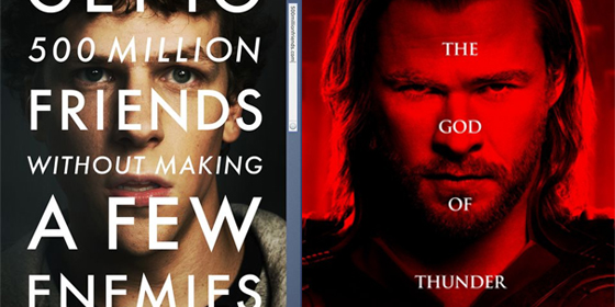
First, take the now iconic one sheet designed by Neil Kellerhouse for David Fincher’s Facebook drama.

Then replace the font with Trajan and place the text over a picture of Chris Hemsworth as the nordic God, in keeping with the current poster trend of text-over-face.

The end result should be something like this:

> Matt Bury and MUBi on the recent poster trend of text-over-face
> Our Thor review

Categories
Interesting Posters

Trajan: The Movie Font

Why do so many movie posters use the Trajan font?

Designed by Carol Twombly for Adobe in 1989, the old style serif typface quickly found its way into pop culture.

It is was used on the bestselling novels of John Grisham, became the official font of various universities around the world (including Bologna, Kansas and Lausanne) and the Assassin’s Creed game franchise.

Politicians love it too, with figures such as Chris Dodd, Tim Pawlenty, Mitt Romney and even Barack Obama using it in past campaigns.

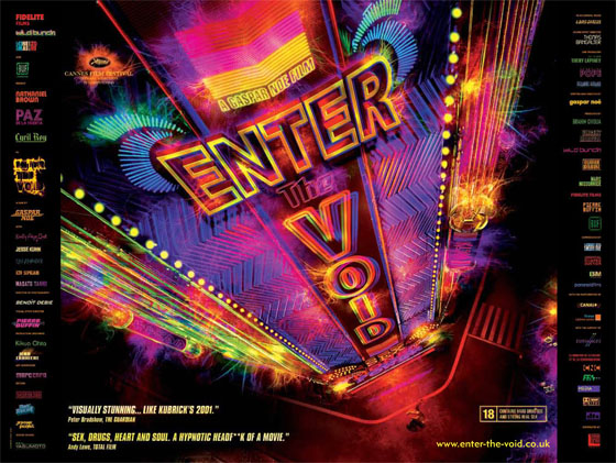
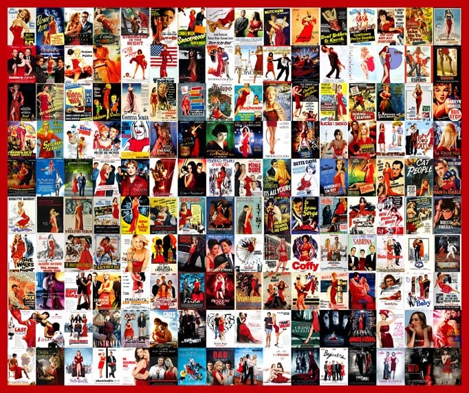
But it became hugely popular with movie poster designers, as this video by Kirby Ferguson demonstrates.Posters which feature the font include Titanic (1997), Lemony Snicket’s A Series of Unfortunate Events (2004) and more recently This Is It (2009).

But check out this slideshow to get some idea of how ubiquitous it has become:

The easy answer as to its success is that it has been used in popular movies, but I think there is a deeper reason as to why it became so popular.

Maybe the old-style classiness projects an image of authority, which might also explain why politicians love it.

This is actually important for upscale mainstream films such as Titanic which are looking for that veneer of class to distinguish themselves from rival fare at the multiplex.

In a sense the font has come to represent a hybrid of commercial success and cultural importance, even if the films using it have neither.

Maybe after the phenomenon of Titanic, it spread like a virus amongst movie marketing departments because they wanted to emulate that elusive holy grail of box office dollars and worthy prestige.

> Find out more about Trajan at Wikipedia
> IMP Awards
> Movie Poster Addict

Categories
Posters

Bugged Actually


If Richard Curtis wrote a movie about Hugh Grant secretly recording the confessions of a tabloid journalist about the News of the World phone hacking affair, then this is what the poster would look like.

Categories
Competitions Posters

Competition: Enter the Void

Gaspar Noe’s Enter The Void is released on DVD on April 25th and to mark the occasion we have some posters to give away.

The winner will get a poster signed by the director and two runners up will get a rather funky double-sided quad poster.

This is the signed poster:

And this is the larger reversible quad version:

If you haven’t seen it, the film made our list of the best films of 2010, where we described it as:

“Technically dazzling depiction of a dead drug dealer that also features what is possibly the greatest opening title sequence of all time.”

The extras on the DVD include:

  • The French Theatrical Trailer
  • International Theatrical Trailer
  • US Theatrical Trailer
  • Set of short teasers
  • Two hallucinatory effects sequences โ€“ Vortex and DMT
  • Making Of The Special Effects featurette

The sensational opening credits sequence can be seen here (select HD for the full effect):

To be in with a chance of winning a poster just answer this question:

Which controversial 2002 film did Gaspar Noe direct?

N.B. The competition closes on April 30th

> Official site for the UK DVD which is out on Monday 25th April
> Official UK Facebook site
> Pre-order Enter the Void from Amazon UK

Categories
Posters

Hitchcock Inception Poster

What would the poster for Inception have looked like if Alfred Hitchcock had directed it?

Maybe his long time designer Saul Bass would have come up with something like this:

(I first saw this over at Shortlist, but if you know who created it just leave the credit in the comments below)

Categories
Cannes News Posters

Poster: The Tree of Life

The latest poster for Terrence Malick’s The Tree of Life has appeared and is a patchwork affair with various characters and scenes from the film.

Look at little closer and you’ll see the dinosaur that is rumoured to make an appearance in the film.

The official website has been unveiled at www.twowaysthroughlife.com and intriguingly they also have a Tumblr site at twowaysthroughlife.tumblr.com

In other news, Empire dropped the bombshell earlier today that the film will be getting a UK release on May 4th, a full week ahead of its expected premiรจre at the Cannes Film Festival, which starts on May 11th.

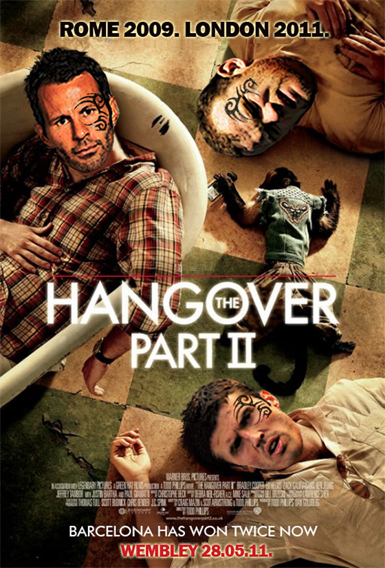
There hasn’t been any official word yet from UK distributor Icon about their release plans, but it seems staggering that it would open at UK cinemas and completely scupper the possibility of what would be one of the most anticipated Cannes screenings in years.

The idea that a high profile festival premiere, featuring Brad Pitt and Sean Penn on the red carpet alongside Malick, would be sacrificed so UK audiences and critics could see the film a week earlier is fairly mind boggling.

It has already been announced that the film will screen there, but whether it will show in competition won’t be officially confirmed until April 14th when Thierry Fremaux announces the full lineup.

As I speak it isn’t listed on the official FDA release schedule, nor is there any word on Icon’s UK website.

According to Hollywood Elsewhere and Thompson on Hollywood, sources at US distributor Fox Searchlight are claiming that the Empire story is incorrect.

> The Tree of Life trailer
> More on the film at Wikipedia

Categories
Posters

Olly Moss Poster Art for Duncan Jones

Designer Olly Moss has done two new posters for the films of Duncan Jones: Moon (2009) and the upcoming Source Code (2011).

[Click here for a larger version]

The latter premieres at SXSW in Austin, Texas this week and opens in the UK on Friday 1st April.

[Via Sound on Sight]

> Olly Moss
> Duncan Jones at the IMDb
> SXSW 2011 Film Lineup

Categories
Posters

The Wikileaks Network

David Fincher recently completed a film about Facebook (The Social Network) and is currentlyย in Sweden shooting a conspiracy thriller (The Girl With The Dragon Tattoo).

Think about it: computer hackers,ย Sweden andย intrigue.

Maybeย his next film should be about WikiLeaks and Julian Assange? ๐Ÿ™‚

> The Girl With The Dragon Tattoo (2011) at the IMDb
> More on the recent leaking of diplomatic cables by WikiLeaks at Wikipedia

Categories
Interesting Posters

Anatomy of a Movie Poster

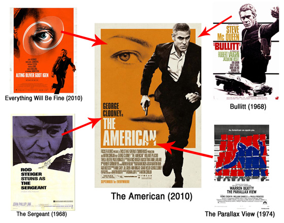
One of the most striking film posters this year was for The American, but what made it so distinctive?

When LA-basedย Mojohouse released the first one sheet for Anton Corbijn’s film, about an enigmatic American lying low in Italy, there was a lot of talk about the retro design.

MUBi listed various films of the 1960s that seemed to be an inspiration for the basic look and feel of the poster:

With its two-color printing, its high-contrast photographs, its monochrome rectangle of color and its billing block within a white frame, it could be a lost object from that era.

Rod Steiger’s The Sergeant (1968) appears to be a particularly strong influence, both in the look and billing of the star.

(Click here for a larger version of the above image)

It is also worth comparing how the lead actor is depicted on the poster: note the similarities between the black and white image of Clooney and Steve McQueen on the poster forย Bullitt (1968).

Another trend of the late 1960s they appeared to have picked up on is the placing of a small photo, or drawing, next to the title and credits.

With The American, it is a silhouette of someone getting shot, which also could be a play on The Parallax View (1974),ย another film involving assassins and paranoia.

Finally, a recent Danish film, Everything Will Be Fine (2010), has a very similar poster: notice the eye, which forms part of an orange backdrop to which a character is running from.

But who influenced who?

> MUBi on The American poster influences
> The American
> More movie poster links at IMP Awards

Categories
Interesting Posters

Fake Criterion Covers

Imagine if George Lucas decided to release the original Star Wars trilogy through the Criterion Collection.

The home video company are renowned for their editions of “important classic and contemporary films” and their tasteful covers.

A thread over at MUBi has highlighted a lot of imaginative redesigns of notable films in the ‘Criterion style’, including Star Wars, Die Hard and 2001: A Space Odyssey.

This gallery features some of the more notable examples:

> WSJ article on Fake Criterion covers
> Official Criterion site

Categories
Posters

BP Inception Poster

[ad]

What if Christopher Nolan directed a new thriller about the BP oil spill?

[Click here for a larger image]

Categories
Amusing Posters

Inappropriate Shrek McDonalds Poster

Is it just me, or could theย tag-lineย for this Shrek Aero McFlurry poster be taken the wrong way?

Categories
Amusing Posters

The Bounty Hunter meets Star Wars

Forget Gerard Butler –ย Boba Fett is the real Bounty Hunter.

[ad]

Categories
Amusing Awards Season Posters

Spoof Best Picture Posters

College Humour have had some fun with the posters of this year’s Best Picture nominees, including Avatar, The Blind Side, Inglourious Basterds, District 9, A Serious Man, Up in the Air and Up.

Whilst snarky, they are also very funny – especially the one for Up.

The rest can be foundย here.

ย 

Categories
Amusing Posters

Kung Fu Panda Kicks Through Glass

Is this bus stop poster for Kung Fu Panda a clever piece ofย marketing or a creative act ofย vandalism?

[ad]

Categories
Images Posters Thoughts

The Difference Between Cinema Posters and DVD Covers

When you compare the poster of a theatrical release with the DVD and Blu-ray cover you often see that they have different approaches.

Up in the Air is a recent release – an acclaimed comedy-drama from writer-directorย Jason Reitman starring George Clooney as an air-mile addicted corporate down-sizer – ย that recently came out on DVD and Blu-ray in the US.

You may notice that the poster you saw in your local cinema (on the above left) is notably different from the cover of the disc you will buy or rent (on the above right).

The cinema poster – designed by BLTย Associates – is fairly conceptual. It depicts the three main characters of the film (Clooney in the middle, flanked by Anna Kendrick on the left and Vera Farmiga on the right) but they are distant, inย silhouette and made to look small by the airport glass and plane outside.

The Helvetica fontย and colour scheme (cool blues, mixed with whites and blacks) are very reminiscent of an airport and the overall effect is neat as it captures both the bittersweet mood and basic themes of the film.

Reitman recently said that he got the basic idea for the poster by taking a similar photo whilst filming on location at an airport but that some folks at Paramount marketing (the studio that funded the film) were keen on getting a little more of Clooney in the image.

After all, if you have paid a considerable amount for a star, you want to get your money’s worth even if he’s working at a reduced rate on a prestige, Oscar-candidate project like this.

But now the DVD and Blu-ray has come out in the US (that would be on the above right), you can see the difference.

Althought they have inverted the colour scheme of the theatrical poster, the main image features a much more prominent Clooney (laughing) alongside Vera Farmiga, with them both laughing at a bar.

The combined effect emphasises the comedy/feel-good aspect of the film alongside the romance and downplays the more serious themes of recession, job firings and isolation that crop up eslewhere in the story.

Personally, I think it looks horrible and doesn’t do justice to the quality of the film, but – even for a home entertainment release – it also looks pretty ropey, as if an intern was asked to do it on Photoshop on his lunch break.

So, what to make of all this?

Firstly, movie posters come out of a tradition where they are seen at cinemas, bus stops and various outdoor displays which mean they have to be larger in size. In comparison, DVD and Blu-rays are smaller so they have less space to grab your attention, often resulting in a face shot of the actors.

Secondly, one of the time honoured traditions in Hollywood is for everyone to blame the marketing if a film doesn’t do well at the box office. Although Up in the Air was by no means a flop – especially given itsย relativelyย lean budget – maybe Paramount felt they could dupe new audiences into thinking it is some kind of romantic comedy.

Thirdly, given that the (literal) shelf life of a film is longer in the shop than it is at cinemas, you would think that more time and effort would be spent on getting it right, rather than just reacting to what happened on the theatrical release.

Finally, it seems that the UK DVD & Blu-ray release of Up in the Air has exactly the same design as the theatrical poster, which could mean that: a) We have better taste over here b) Paramount UK couldn’t be bothered to change it or c) None of the above applies.

[ad]

> A lengthy blog post from 2007 entitled Why Do Great Movies Get Awful DVD Cover Art?
> Anna Kendrick talks to me about Up in the Air

Categories
Posters

Alternative Pulp Fiction Poster

If the Criterion Collection ever do a release of Pulp Fiction then they could do a lot worse than use this poster by Ibraheem Youssef on the cover.

Categories
Posters

The Dark Knight vs Inception

[ad]

The newly released poster for Christopher Nolan’s Inception is a little similar to one of the Joker one sheets for The Dark Knight.

Is it a deliberate ploy by Warner Bros marketing to remind people that the films share the same director? Or has someone run out of ideas?

More to the point, why not reference that cool spinning top thing on the official website?

Categories
Posters

Iron Man 2 poster

Iron Man 2 poster

The first poster for Iron Man 2 has been released by Marvel and Paramount.

(For non-geeks, the grey dude is War Machine).

Categories
Amusing Posters

Chaotic Mr Fox Poster

Fantastic Mr Fox Antichrist

A clever poster mash-up of Fantastic Mr Fox and Antichrist by Sam Smyth.

And let’s not forget that YouTube mashup:

Categories
Posters

Invictus one sheet poster

Invictus poster

Above is the first official one sheet poster forย Invictus, the upcoming film based on Nelson Mandela‘s life during the 1995 Rugby World Cup in South Africa.

Directed by Clint Eastwood, it stars Morgan Freeman as the then South African President and Matt Damon as Francois Pienaar, the South African team captain.

Warner Bros will be be pushing it for an Oscar campaign andย it is due for release in the US on December 11th and in the UK on Friday 5th February.

Images taken on the set surfaced on a South African website and can be seen here.

Categories
Posters

Revolutionary Road vs Love Happens

Revolutionary Road vs Love Happens

Check out the similarities between the posters for Revolutionary Road and Love Happens.

Note the use of white space, the similar fonts and the about-to-kiss position of the stars.

I’m guessing that’s about all these films have in common though.

Categories
Posters Thoughts

Polanski Poster Irony

Roman Polanski posters

The Roman Polanski arrest story still seems set to run and run (most likely until he gets deported to California) with Hollywood luminaries calling for his release, whilst others (i.e. those who have read the disturbing 1977 testimony of the girl he had illegal sex with) denounce him in the comment sections of websites all over the Internet.

The whole story reads like a Philip Roth novel on steroids, but someย Polanski movie posters highlighted on The Auteurs made me wonder if there was some kind of cosmic subtext to his career.

In the the 2008 documentary Roman Polanski: Wanted and Desired, the prosecutor Roger Gunson commented on the recurring themes of the director’s work:

“Every Roman Polanski movie has the theme [of] corruption meeting innocence over water”

The infamous events of March 1977 could be interpreted in these terms: Polanski (corruption) met Samantha Geimer (innocence) over water (Jack Nicholson’s jacuzzi).

But do the posters of his films shed any light on the unfolding drama?

Some of them are ironic, to say the least.

Repulsion (1965) had one poster with two hands touching a woman’s body:

Repulsion UK poster

Another had the tagline:

“The nightmare world of a Virgin’s dreams becomes the screen’s shocking reality!”

Repulsion

The Fearless Vampire Killers (1967) has the image of a vampire about to sink his fangs into a half naked woman in water and, for good measure, carries the warning:

“Not suitable for children”

The Fearless Vampire Killers

What? (1972) had a poster which is almost certain to give any card-carrying feminists pause for thought – a buxom woman is pictured bending over the top of the grinning mouth of a man.

What poster

The Tenant (1975) has the eerily prescient words:

‘No-one does it to you like Roman Polanski’

The Tenant

If only Samantha Geimer’s mother had taken this statement literally.

Tess (1979), his adaptation of the Thomas Hardy novel, has the lengthy tagline:

“She was born into a world where they called it seduction, not rape”

Tess poster

There is also the curious line:

“She was Tess, a victim of her own provocative beauty”

Was Columbia’s marketing department trying imply something with Polanski’s first film in ‘exile’?

Frantic (1988) has the simple three wordย tag line:

“Danger. Desire. Desperation”

This is about as succinct a description of the thirty-two year old affair that I can think of.

Frantic poster

Bitter Moon (1992) has the provocative thud of a Carry On movie:

“A kinky voyage with a head full of steam”

Bitter Moon

Death and the Maiden (1994) has the rather poetic:

“Tonight, mercy will be buried with the past”

Perhaps reflective of the anti-Polanski brigade who want to see him brought to justice?

Death and the Maiden

The Ninth Gate (1999) has theย marvellously conciseย statement:

“Leave the unknown alone”

The Ninth Gate

But perhaps the most fitting poster of all is for Marina Zenovich’s 2008 documentary, Roman Polanski: Wanted and Desired:

“The truth couldn’t fit the headlines”

Roman Polanski - Wanted and Desired

It was presumably intended as a comment on how theย back roomย legal shenanigans were obscured by the initial media representation.

But given the ongoing twists and turns of the case that led to HBO editing the documentary before it aired last year and the startling admission by a key interviewee that he lied in the film, it seems a more pertinentย statementย on how the story continues to confound, repulse and fascinate those who try to explain it.

Categories
Posters

Australian Antichrist poster

This Australian poster for Lars Von Trier’s Antichrist by Jeremy Saunders is really quite striking.

Australian Antichrist poster

Provocative, stylish, and with a killer font, it is actually more impressiveย than the film itself.

[Via The Auteurs]

Categories
Posters

Avatar poster inspired by Stephen King novel?

It is probably a coincidence but a comment on Hollywood Elsewhere by LexG points out that the new Avatar teaser poster (which I’m guessing is official, despite previous fake posters and trailers for this film) looks a lot like the 1980 paperback cover of The Stand by Stephen King.

Avatar The Stand

> James Cameron talks about Avatar at Comic-Con
> More on The Stand at Wikipedia

Categories
Images Posters Random

Looking for United

There’s a new Ken Loach film about a Manchester United legend coming out.

But what if he made one about last night’s Champions League final?

Looking for Utd

> Official site for Looking For Eric
> BBC Sport on last night’s game

Categories
Posters

The Bruno Poster

The first one-sheet poster for Bruno has been released by Universal.

Bruno poster

I’m not sure about the central image but the tagline is great.

> Bruno at the IMDb
> Check out the trailer

Categories
Amusing Posters

Crank 2 tagline

carnk-2-tagline

The above photo of the poster forย Crank 2ย was taken by Twitter userย rionharmon.

I might be wrong, but I actually think the tagline its quite fitting for the ridiculous, over-the-top nature of the Crank movies.ย 

> Crank 2 at the IMDb
> A UK viral site for the film with a rather rude URL

Categories
Interesting Posters

40 Great Independent Film Posters

[ad]

Smashing Magazine have compiled a terrific list of 40 Exquisite Independent Film Posters.

I think my favourites are: Zoo, Primer, Taxi to the Darkside, Brick, The Descent and Son of Rambow.

Also great are: Half Nelson, Sideways, Requiem For a Dream (possibly my favourite), Transamerica, Hard Candy and Grizzly Man.

It goes without saying that all of these films are worth buying.

> Original post at Smashing Magazine
> Empire’s list of ‘the greatest Independent films ever made’
> Find out more about indpendent film at WIkipedia
> Indie Film section at the IMDb

Categories
Interesting Posters

Posters: Taken & The Bourne Supremacy

I saw the new new Liam Neeson thriller Taken last night – which is actually very entertaining – and on the way out of the cinema I caught a glimpse of the UK poster.

The story is about an ex-CIA agent (Neeson) who goes after his kidnapped daughter in Paris.

It reminded me of something….

An ex-CIA agent who wreaks havoc against shady people in Europe and a poster with a mean and moody character, gun and long dark jacket.

Sound familiar?

To be fair there are some differences between the films, but the poster designs are strikingly similar.

> Taken – Official site
> The Bourne Supremacy at the IMDb

Categories
Awards Season Posters

New Che poster

This is the first one sheet poster for Stephen Soderbergh‘s biopic of Che Guevara, which consists of two films: The Argentine and Guerilla.

It screened at this year’s Cannes film festival as one four hour epic called Che, but it looks likely that it will be released as two films.

That is of course when it finally gets a US distributor. The production was financed by the French sales company Wild Bunch, but since bowing at Cannes there has been a lot of speculation as to why no US company has bought the rights to screen it.

However, it has been pre-sold to several major territories such as France (Warner Bros.), the U.K. (Optimum), Scandinavia (Scanbox) and Italy (Bim Distribuzione) and will it will be shown at the upcoming New York and Toronto film festivals. In the latter will screen as one whole film, as well as in two parts.

Variety reported back in February that three US distributors (one of whom must surely be The Weinstein Company) were ‘circling’ before Cannes – perhaps they are waiting until it screens at these festivals before taking the plunge. But given that this looks and feels like an award season contender – albeit a left field one – then it may be leaving it a little late to drum up buzz and resultant box office.

My guess is that who ever ends up with the film in the States should screen the 4 hour version in a platform release (i.e. just New York and LA) and then roll it out as two films in order to recoup costs.

A four hour film of this nature in wide release just looks like commercial suicide. Whatever happens, lets just hope that it does actually secure get a US theatrical release and doesn’t end up premiering as a 6 part mini-series on HBO.

Here in the UK The Argentine opens on January 2nd whilst Guerilla follows on February 20th.

> Official site for Che
> The Argentine and Guerilla at the IMDb
> Reactions to the film at Cannes
> Karina Longworth of speculates about the film at SpoutBlog

Categories
In Production News Posters

W. teaser posters and on set footage

When it was announced that Oliver Stone was to make a feature film about George W. Bush simply called W. my first reaction was that it was too soon.

Surely some distance and perspective was needed on a film about one of the most divisive Presidents in US history?

Plus, the schedule for the film seemed rather ambitious – it started shooting in May for a November release, which by current Hollywood standards seemed rather quick.

However, I have to admit that the cast he has assembled is impressive:

Plus, the early leaked trailer that surfaced recently looked much more promising than I had expected.

Now, two more teaser posters have been released which seem to hint at a savvy marketing campaign from Lionsgate and their agency Crew Creative.

Plus, Access Hollywood has just released some footage of Josh Brolin as the 43rd President – it appears to be B-roll footage shot on the set which is why the green screen backdrop is visible.

After the critical mauling of Alexander and the restrained sorrow of World Trade Centre, I imagine Oliver Stone is hungry to return to the fire and energy of his earlier films.

Could this be the film to return him to former glories?

We shall find out on November 7th, when it opens in the US and UK.

> W. at the IMDb
> First images from the movie
> More information on the film at Wikipedia

Categories
Amusing Posters

Posters spoofing those annoying anti-piracy adverts

These two posters accurately reflect the frustration of anyone who has legally bought a DVD and put it in the player only to be confronted with a patronising advert (that you can’t skip!) which informs you that piracy (the very thing you just haven’t done) is both bad and wrong.

[Posters via Broken TV]

> Read more posts on piracy at Broken TV
> Spoof anti-piracy mashup from The IT Crowd

Categories
Interesting Posters

100 Great Movie Posters

TC Candler has compiled a neat list of great movie posters.

Some of my favourites include:

There were some striking movie posters last year including Zodiac, Sunshine and – my favourite – No Country For Old Men:

If you have any favourite posters let me know in the comments below.

[Link via Digg]

> The full list of 100 posters
> Movie Posters database
> Poster Wire – Excellent blog about movie posters
> Movie Poster Forum

Categories
News Posters

Poster: Where in the World is Osama Bin Laden?

Cinematical have posted a new poster for Morgan Spurlock‘s latest documentary Where in the World is Osama Bin Laden?

Where in the World is Osama Bin Laden?

The title of the film is pretty self explanatory but if you can also check out the trailer here:

It is out at US cinemas on April 18th and in the UK on May 9th.

> Where in the World is Osama Bin Laden at the IMDb
> Official site for the film
> James Rocchi of Cinematical interviews Morgan Spurlock at the Sundance Film Festival

Categories
In Production Posters

Quantum of Solace – Teaser poster

This is the first teaser poster for the new Bond film Quantum of Solace.

Quantum of Solace teaser poster

Notice how the image shows 007 just after the climax of Casino Royale – which is where the new film begins.

> Official site for James Bond
> IMDb entry for Quantum of Solace
> Check out more photos from the launch press conference at Pinewood

(All photos ยฉ 2008 Danjaq LLC, United Artists and Columbia Pictures)

Categories
Interesting Posters

Godfather Picture

Someone has made a replica of the poster from The Godfather using every word from the script.

Check it out here and click through for the enlarged image.

Godfather script picture

[Link vis Digg]