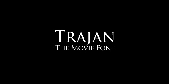
Why do so many movie posters use the Trajan font?
Designed by Carol Twombly for Adobe in 1989, the old style serif typface quickly found its way into pop culture.
It is was used on the bestselling novels of John Grisham, became the official font of various universities around the world (including Bologna, Kansas and Lausanne) and the Assassin’s Creed game franchise.
Politicians love it too, with figures such as Chris Dodd, Tim Pawlenty, Mitt Romney and even Barack Obama using it in past campaigns.
But it became hugely popular with movie poster designers, as this video by Kirby Ferguson demonstrates.
But check out this slideshow to get some idea of how ubiquitous it has become:
The easy answer as to its success is that it has been used in popular movies, but I think there is a deeper reason as to why it became so popular.
Maybe the old-style classiness projects an image of authority, which might also explain why politicians love it.
This is actually important for upscale mainstream films such as Titanic which are looking for that veneer of class to distinguish themselves from rival fare at the multiplex.
In a sense the font has come to represent a hybrid of commercial success and cultural importance, even if the films using it have neither.
Maybe after the phenomenon of Titanic, it spread like a virus amongst movie marketing departments because they wanted to emulate that elusive holy grail of box office dollars and worthy prestige.
> Find out more about Trajan at Wikipedia
> IMP Awards
> Movie Poster Addict
