
One of the most striking film posters this year was for The American, but what made it so distinctive?
When LA-based Mojohouse released the first one sheet for Anton Corbijn’s film, about an enigmatic American lying low in Italy, there was a lot of talk about the retro design.
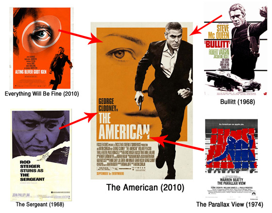
MUBi listed various films of the 1960s that seemed to be an inspiration for the basic look and feel of the poster:
With its two-color printing, its high-contrast photographs, its monochrome rectangle of color and its billing block within a white frame, it could be a lost object from that era.
Rod Steiger’s The Sergeant (1968) appears to be a particularly strong influence, both in the look and billing of the star.
(Click here for a larger version of the above image)
It is also worth comparing how the lead actor is depicted on the poster: note the similarities between the black and white image of Clooney and Steve McQueen on the poster for Bullitt (1968).
Another trend of the late 1960s they appeared to have picked up on is the placing of a small photo, or drawing, next to the title and credits.
With The American, it is a silhouette of someone getting shot, which also could be a play on The Parallax View (1974), another film involving assassins and paranoia.
Finally, a recent Danish film, Everything Will Be Fine (2010), has a very similar poster: notice the eye, which forms part of an orange backdrop to which a character is running from.
But who influenced who?
> MUBi on The American poster influences
> The American
> More movie poster links at IMP Awards