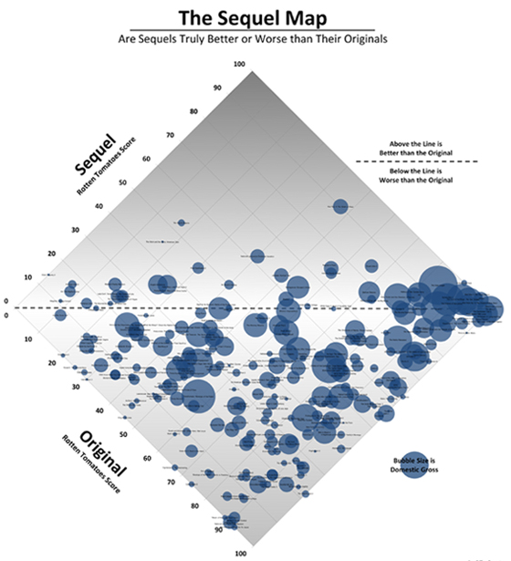
Box Office Quant have posted a map which seeks to display whether certain films were better or worse than the original films.
Using Rotten Tomatoes, the originals’ scores on the X-axis are put against the sequels’ scores on the Y-axis.
Sequels around the centre line have a similar rating to the original; those above have surpassed the original; and those below, are ones that were deemed worse.
Each film is represented by a bubble and the size of each reflects the box office gross.
There are also a couple of rules: only the second film in any series is included and reboots and remakes are not counted.
[Click here for an enlarged image]
> Box Office Quant
> List of film sequels by box-office improvement at Wikipedia

